Love current trends and want to incorporate them into your wedding? Then Claire Pryce from Claryce Design has some tips for you in today’s blog; showing you how to be on trend with your wedding stationery. She will be exhibiting with us in Harrogate on October 8th so come along and speak to her in person.
As a designer I am always looking for ways in which I can be innovative, not only so that I can continually offer my customers something fresh and new but also because I get a buzz from any creative challenges! I constantly watch out for new styles and trends online, in the shops, in the media and in magazines etc. to ensure that I am not missing out on anything that could be translated into my wedding stationery line.
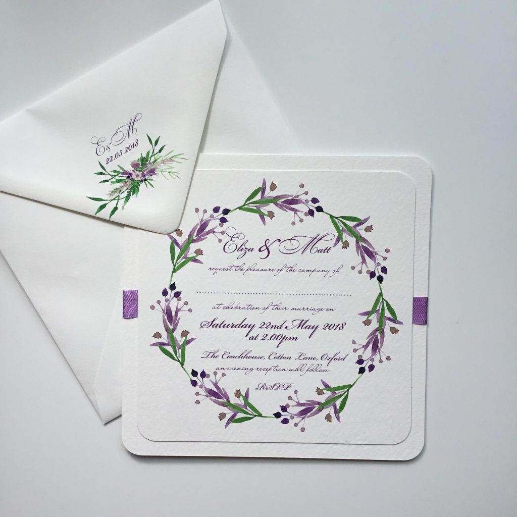
Claryce Design began as a kitchen table business that specialised in vintage stationery – predominantly wedding stationery. This is still the case but, as well as offering traditional designs I have in the past year branched out into modern, classic, trend led designs for the contemporary bride and groom.
Much as I love working with floral and botanical images, using modern trends allows me to use my sense of colour, scale and pattern in my range. Let me introduce you to some of my stationery designs that have been inspired by recent trends.
Marble wedding stationery
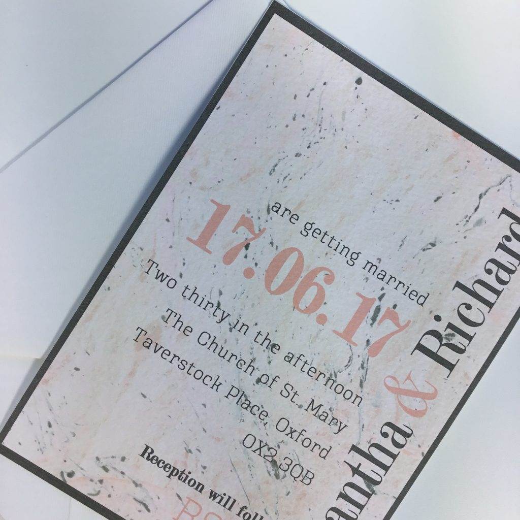
Marble is ironically ‘hot’ right now and I can fully understand why. Nature is a miracle and the natural processes that produce marble and all its many assets are no less so. Marble makes the perfect background for strong typeface and design elements.
In this design I chose a subtle blush pink and grey colour combination which is very popular at the moment. I extracted these two colours from the marble to use for the text which is bold and punchy. Because this invitation relies purely on colour and fonts I have used various typefaces and changed up the scale and direction of the text to add interest. To balance the weight of the wording I have bordered the invitation in dark grey.
Metallic wedding stationery
Metallics are everywhere. And I love them!
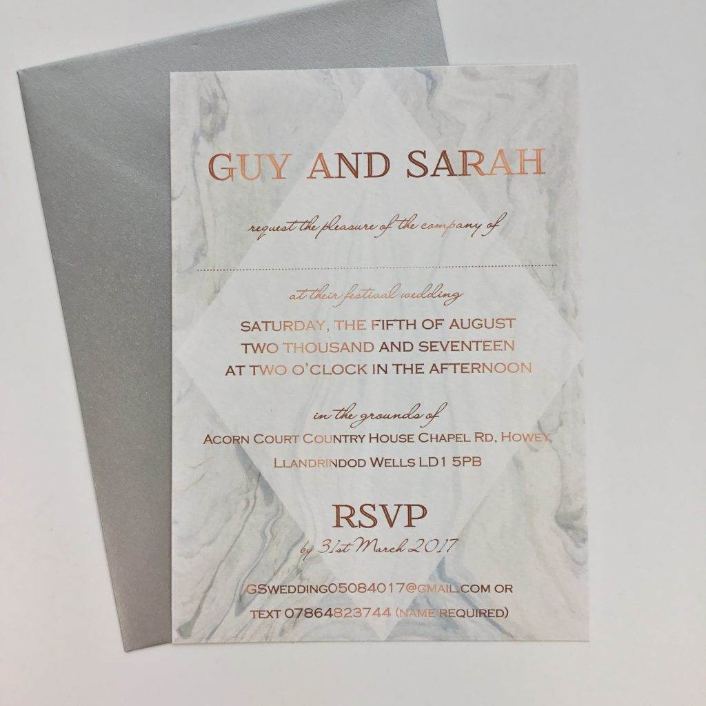
Foiling is very popular in stationery, however I find it is prohibitive in terms of cost, so I have created a method of printing that makes the letters appear to shine for the effect without the price. Copper is my favourite metallic but I am also trying to perfect rose gold…… This faux bling makes the stationery appear really opulent and special.
For this invitation I chose a ‘soft’ grey marble for the background which really allows the copper wording to ‘shine’. A metallic pewter coloured envelope completes the look.
Chevron wedding stationery
Chevrons first appeared on the catwalk in the 1950’s with Missoni’s eye catching designer knitwear created by Tai and Rosita Missoni. The zigzag stripes were simple yet striking.
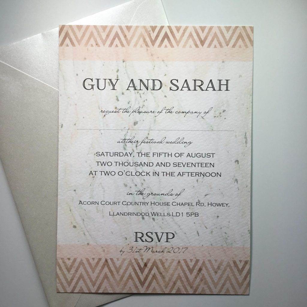
Chevrons may not seem like the perfect pattern for wedding stationery, but when you use the right colour and texture the effects can be stunning.
For this invitation, I have used blush pink chevron stripes and laid them over a shimmering copper background. I have used this as a border at the top and bottom with the blush pink and grey marble in between. Strong typography is used so that it is not lost in the overall design. A plain pink border separates the chevron from the marble so that it doesn’t blend in. I love the tribal feel of this design.
Geometrical wedding stationery
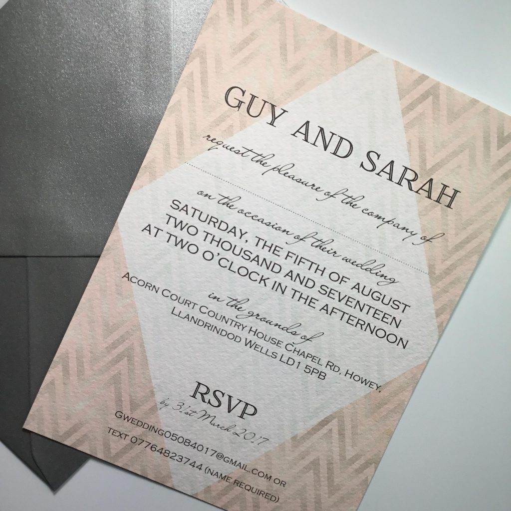
Geometrical shapes are being used by designers in many products from jewellery to housewares. I have not explored the possibilities of these as much as I would like – yet! For a few of my latest designs I have simply used a diamond in the centre to create a border and to lighten the centre to bring more attention to the wording.
Chevrons and the diamond centre work really well together here. The blush pink chevron stripes are laid over a faux shimmering silver background that makes it look really luxurious yet soft and romantic. The diamond centre enhances the chevron pattern in the corners while making the wording really stand out. I think this is one of my favourite designs this season.
Check out all Claire’s work online and hope to see you at Harrogate

